Shooting for the sky
The Cleverest reader and photographer Salvatore points out that my recent shots of the Brooklyn sky looked manipulated, and that he’d like to see an original for comparison’s sake. So I’m taking the time to do another quick Lightroom tutorial to show some of the work that goes into making the style of photography that I enjoy making, which for lack of a better word, I call “it” photography.
The original photo. Roll-over to see step one:
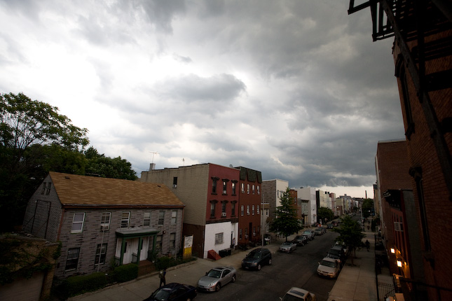
Step One
The sky in the original shot may look too bright, but since I was shooting RAW, it wasn’t blown out. Some with some of the darker areas of the street – they look a little dark on screen, but I know that since I made a well-exposed raw file, I’ll be able to lighten those parts and bring out some of the detail hiding behind those pixels.
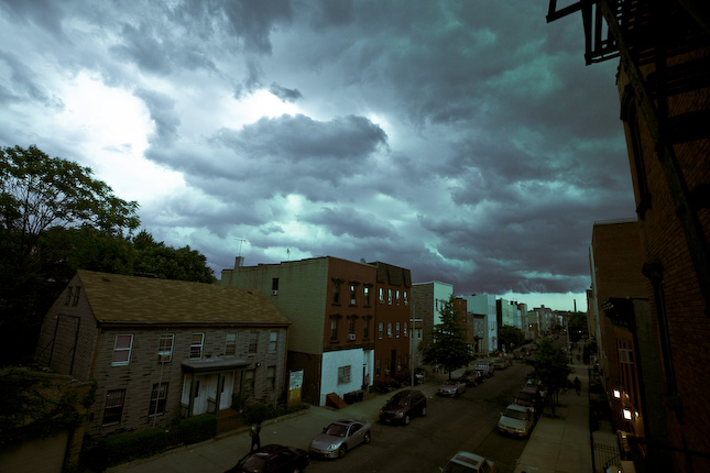
After sliding the “Recovery” up and the “Contrast” down, I played with the “Temp” and the “Tint” to make the sky a little less flat, adding a nice blue hue. The human eye sees blue as a dark color, which also helps to darken the sky’s overall appearance.
So now the sky’s looking good but the street’s way too dark. Let’s move on the Part 3.
The sky’s looking good – now he hit the streets.
Step Two
Now we use that magical slider called “Fill Light.” What that does is brighten up all the areas of the photo that looked dark and flat and boring, and suddenly the photo starts to look more evenly exposed.
After the addition of slight color adjustments to make the color temperature a little chillier, I added a slight vignetting around the edges of the photo to subtly draw you in and add an increase of about 30% to the photo’s total perceived awesomeness.
So there you have it. If you found this interesting you might also want to read a similar tutorial about the homeless campaign I recently shot.